SPRINGBOARD – YOUR NEW EXPERIENCE!
Announced in 2018, Springboard, Anaplan’s “New UX” (new user interface), was THE innovation at the end of 2019. With this new interface, Anaplan aims to meet its customers’ main expectations and reinvent its ergonomics. Overall, mission accomplished with a completely revamped interface and a mobile application (iOS and Android) that gives us the impression of facing a brand new solution. But then, is it a simple cosmetic refresh or a real transformation? What new features? How to set things up to take full advantage of it?
Through a series of articles, we will seek to answer these questions. But first, we will focus on the web version of the interface.
NEW UX – NEW EXPERIENCE
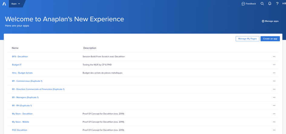
Figure 1: “Apps”, the new homepage for end-users.
For a regular user, at first glance, it’s easy to see that the user interface has been completely redesigned.
To access this New UX, you will need to go through a new window titled “Apps”. From there, you can make content available to your users in the form of an App (a set of screens in which it is possible to navigate and interact with data).
Which could look like this:
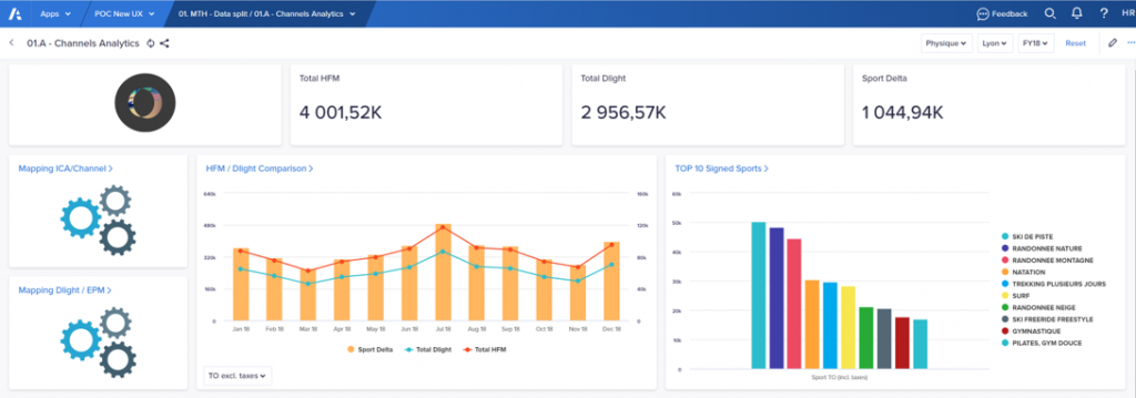
Figure 2: “Board”, a Dashboard to highlight your data.
In technical language, the term “Page” is used, which, compared to the classic interface, would correspond to a Dashboard. We will see later in the article that these “Pages” are of two types (“Boards” and “Worksheets”) to specifically meet user needs. To make your data speak, you will now use “Cards”. Different types exist and will allow you to illustrate the data (we will come back to this later). Create several “Pages”, connect them and organize them within the same App, grant access rights to your users and presto, you have the power of the New UX!
BOARD VS WORKSHEET
As mentioned previously, this new interface is built on the principle of Pages, and more specifically “Boards” or “Worksheets”. We will now explain when to use them, and what their contributions are in terms of reporting.
BOARD
You will favor a Board if you need to offer something visual and synthetic. The objective is to allow for quick analysis, at a glance, using the various graphs or other elements offered by the solution. Its content is based on Cards: text, images, or graphs, each must be able to provide specific analysis, different added value, and facilitate the reading of information for the user.
For example, if you want to set up an inventory or stock tracking application, you can manage images per product. Thanks to a selector on a list of products, the images will update with each item. Another example, if you need to set up performance tracking for a department, you will favor the use of graphs and KPIs.
You can also perform nested analysis using quick links. Indeed, use graphs to illustrate data, but also their titles to insert a link to a more detailed analysis, for example.
As for data entry on this new UX, it is not automatically available. The administrator in charge of building the application can choose the elements where the end-user will have the necessary authorizations.
The Board example below highlights the performance of a brand’s stores. On the left side, you will find the brand’s logo and 3 indicators that we want to highlight; in our example, turnover, margin, and the number of products sold. In the center is the main information illustrated by a graph. Finally, on the right, you can consult other information such as quantities sold vs. an average selling price, or store traffic.
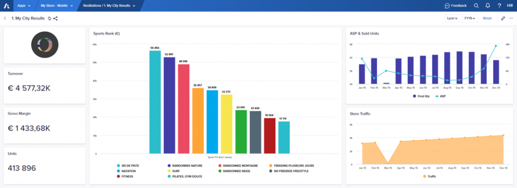
Figure 3: Example of a store performance dashboard.
Apparently, the Board has an answer for everything, doesn’t it? Well, no, if you want to display large tables, it is preferable to opt for a Worksheet!
WORKSHEET
It is thanks to the Worksheet that you will be able to highlight large data tables. You can perform analyses there, as well as data entry. In short, this is where a user will be able to delve deeper and examine their datasets in detail.
On the right side of the screen, Anaplan allows you to insert additional elements to illustrate your data or insert links to other pages of your application for smoother navigation.
To illustrate this point, in the Worksheet below, we have recalled a table of average exchange rates by current currency. To illustrate this content, we have inserted a graph in the form of a curve to visually represent the trend of the exchange rate over time.
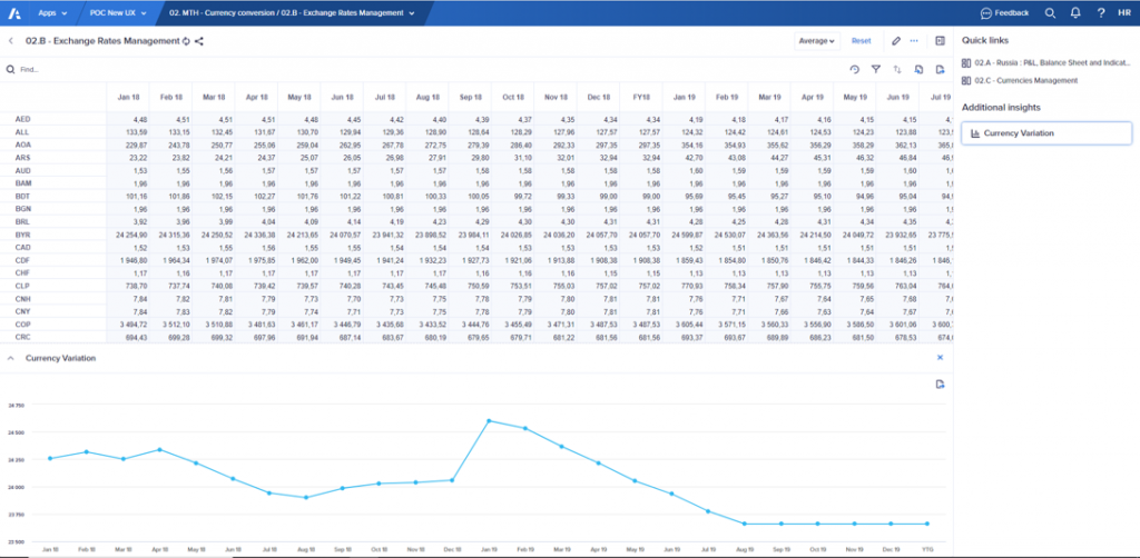
Figure 4: “Worksheet”, the second data formatting alternative.
THE USE OF CARDS
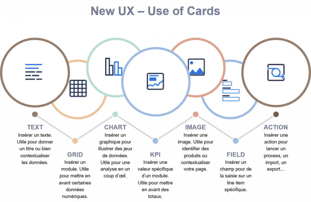
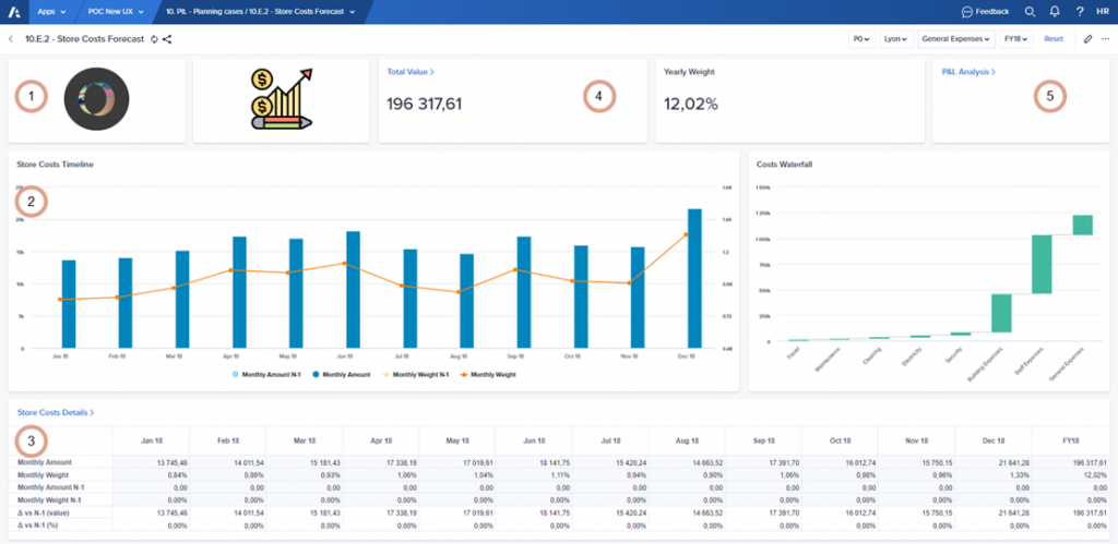
The use of “Cards” in the new interface is a central point of modeling. Both Boards and Worksheets rely on their use to highlight and illustrate datasets. To date, there are 7 types that you can manipulate to create content in your applications.
As an illustration, here’s what it could look like:
In the “Tips” section, a library named “Card Template” is available. You can save an element that proves to be recurrent in your application, to use it repeatedly, without having to systematically reconfigure it.
MELTONERS FEEDBACKS
Since several MeltOners have already used this new interface for our clients, we are taking advantage of this article to give you a brief verbatim of our consultants’ feedback:
Marion Baptiste – Anaplan Consultant.

I really like the interface! This is the area where Anaplan needed to improve, in my opinion. Accessibility and ease of navigation are also strong arguments for new users to get started. I also appreciate the diversity of data formatting options, with a special mention for the KPI, which is something we couldn’t leverage before! I would also have liked to be able to create a type of homepage to optimize navigation within an application.
Hugo Roch – Anaplan Consultant.
 The interface’s maneuverability and the simplicity of inserting elements are my arguments in favor of this UX. Navigation is natural, intuitive, which was lacking in the previous user experience. I particularly like the mobile application. In the long term, I think it can become a considerable asset for everyone, especially since the last update and the ability to edit data! The only drawback is the filters, which cannot be sequenced at the moment. The homepage contains information that seems of little use to me, such as the “Most Recent” tab.
Camille Maurice – Manager and Master Anaplanner.
 I think the new UX brings an essential refresh to Anaplan’s ergonomics, despite some still-awaited developments concerning functionalities already present in the classic interface. Overall, the interface is much more modern, and navigation is simplified and native. We appreciate not having to create actions to update Dashboards anymore. I would add to this the possibility of entering data via a form, or accessing data from multiple models via a single app. This opens up new possibilities such as an executive cockpit or cross-functional management, for example. In short, a more than welcome transformation!
In conclusion, this new UX was worth the wait. Anaplan has listened to its customers and partners to bring not only a visual refresh but also deeply revised ergonomics and functionalities, to the point where it feels like a new solution!
Updates are regular – 4 new features were delivered during the writing of the articles! – and many improvements are yet to come: new visuals (scatter plots, maps, enriched KPIs, …), new functionalities (we are eagerly awaiting the integration of collaborative chat and predictive analysis functions).
In upcoming articles, we will discuss in detail the functionalities of the Anaplan mobile app as well as best practices for modeling in this new UX.
Keep tuned!
Are you already using Anaplan, and would you like to know more about how to switch to the new interface? We are available to assist you. Please do not hesitate to contact us at cmaurice@meltone.com and hroch@meltone.com.
Let’s discuss your challenges and our solutions
Let’s talk about your project and discover how MeltOne can turn your challenges into concrete, high-performing solutions.